Matilda Demo
10.2025

Overview
Matilda represents Australia's first large language model, trained specifically on Australian Football League data for this demonstration. As part of Maincode's design engineering team, I served as both the UX/UI designer and front-end developer for the demo interface, which premiered at South by Southwest Sydney. The challenge was to create an interface that felt intuitive while making AI interactions engaging for AFL fans.
You can check out a preview of the demo here.

Matilda demo at SXSW
The Design Challenge
The core problem was twofold. First, most AI chat interfaces feel generic and corporate, failing to reflect cultural context or domain-specific knowledge in their presentation. Second, AFL statistics are inherently complex and multidimensional, making them difficult to communicate through text alone. Our users needed to quickly understand player performance, team dynamics, and historical comparisons without wading through paragraphs of response text.
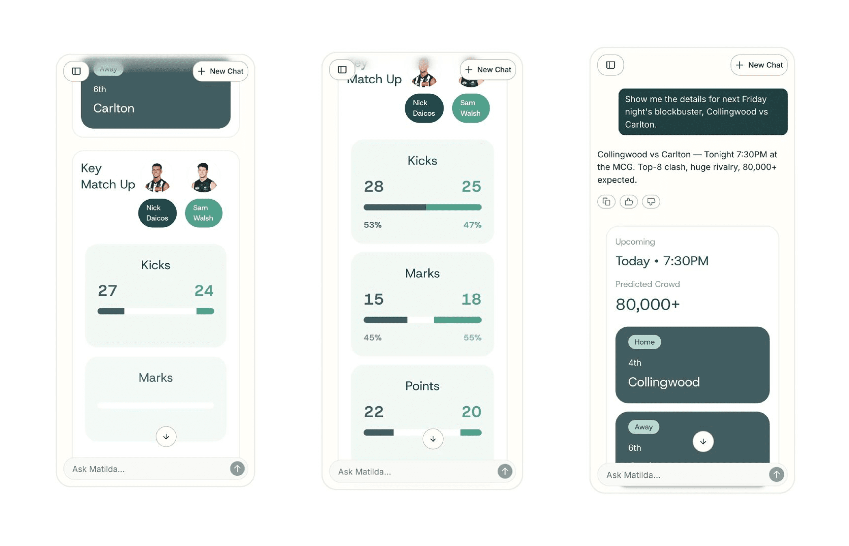
I began by considering typical user questions AFL fans might ask: "How did Richmond perform this season?" or "Compare Dusty Martin's stats to similar players." Each question type revealed opportunities to visualise data rather than simply describe it. This led to the concept of dynamic data widgets that could populate alongside conversational responses, creating a hybrid interface that felt both personal and information-rich.
Early designs for Matilda demo
Design Trade-Offs and Decisions
One significant trade-off emerged around interaction complexity. Early prototypes featured highly interactive widgets where users could drill down into every statistic, toggle between seasons, and customise views extensively. User testing revealed this created cognitive overload. People wanted quick insights, not another analytics dashboard. We scaled back to curated, context-aware widgets that showed the most relevant data for each query. This meant building intelligence into what data the system surfaced, not just how it was displayed.
Another critical decision involved the chat paradigm itself. Traditional chatbots stack messages vertically in a linear timeline. For a demo environment where people interact briefly, this created a problem: users couldn't see the full capability at a glance. We introduced a spatial layout where widgets could be arranged side by side, creating a dashboard-like feel while maintaining conversational flow. This broke from convention but better suited the showcase environment of SXSW.
The visual design required balancing Maincode's emerging brand identity with AFL's existing visual language. A restrained colour palette was chosen that echoed team colours without favouring any specific club, using ochre and earth tones from the Maincode brand as neutralising elements. Typography needed to be bold enough for exhibition displays yet refined enough to signal technical sophistication.
Interactive AFL widgets
Iterative Development Process
We operated in weekly design and build sprints, each cycle producing a testable prototype. For each prototype, UX testing was performed with AFL and sports fans. The feedback we received from these sessions helped inform further UI iterations.
One key challenge came in that some users wanted to see more team colours emerge in the prototypes, despite the fact that it was important to keep the colours pared down and fairly simple. It made us in the Design Engineering team consider whether this demo was meant ultimately to be an interactive AFL experience first and foremost, or a demo of Matilda. Ultimately we decided that given the demo is showcasing Matilda and the AI manufacturing capability at Maincode, we decided to keep the colours more in line with the Matilda identity.
Technical Implementation
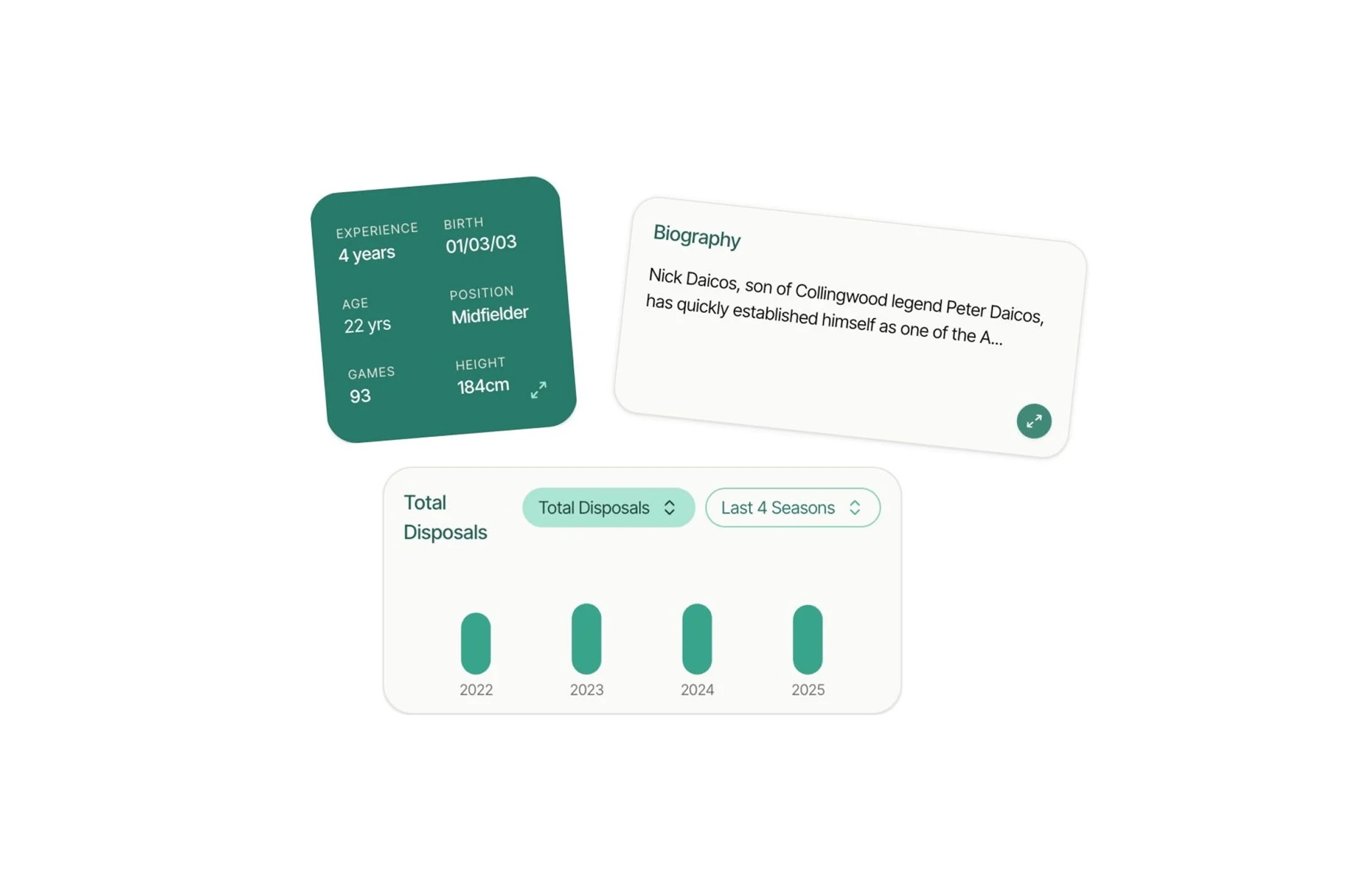
The front-end architecture needed to be modular to accommodate the variety of widget types. I built a component library using Ladle.dev, with each widget type (player cards, stat comparisons, timeline visualisations, ladder positions) as a self-contained component. This allowed the AI team to trigger specific widgets based on query intent without requiring front-end code changes for each new query pattern.
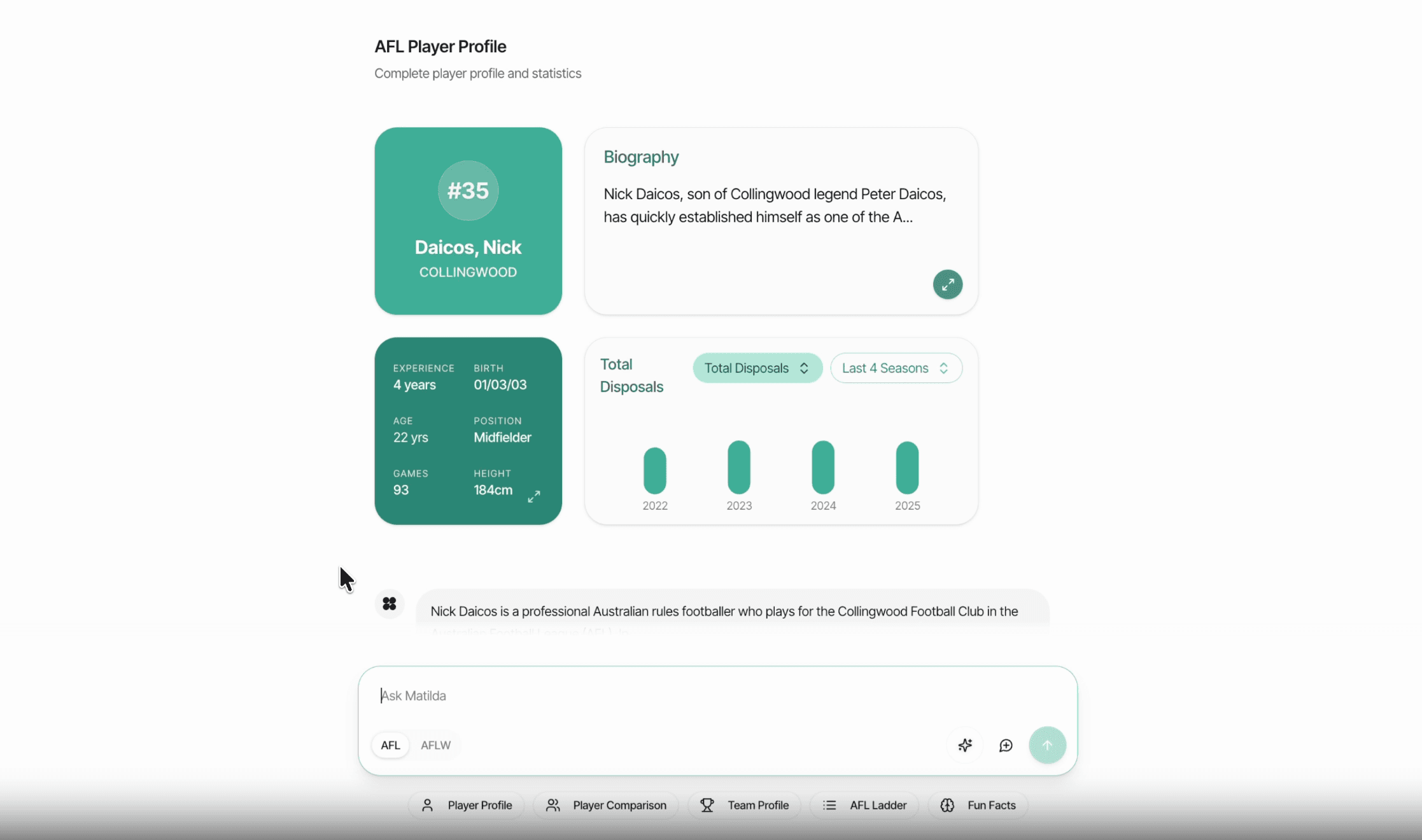
Widgets in Matilda Demo
Learnings and Reflection
This project fundamentally changed how I think about AI interface design. The most important insight: AI interactions don't have to be purely conversational. The best interfaces know when to show rather than tell. By combining natural language with structured data visualisation, we created something that felt more capable and trustworthy than a text-only chatbot.
I learned to design for both the immediate interaction and the ambient impression. The interface needed to be intuitive and visually compelling from across the booth while remaining functional up close. This dual-scale thinking informed the layout decisions.
Working at the intersection of design and development revealed the value of understanding both disciplines deeply. When I encountered a design challenge, I could assess technical feasibility immediately. When technical constraints emerged, I could pivot the design without losing conceptual integrity. This accelerated the project and produced better outcomes than a traditional designer-developer handoff would have.
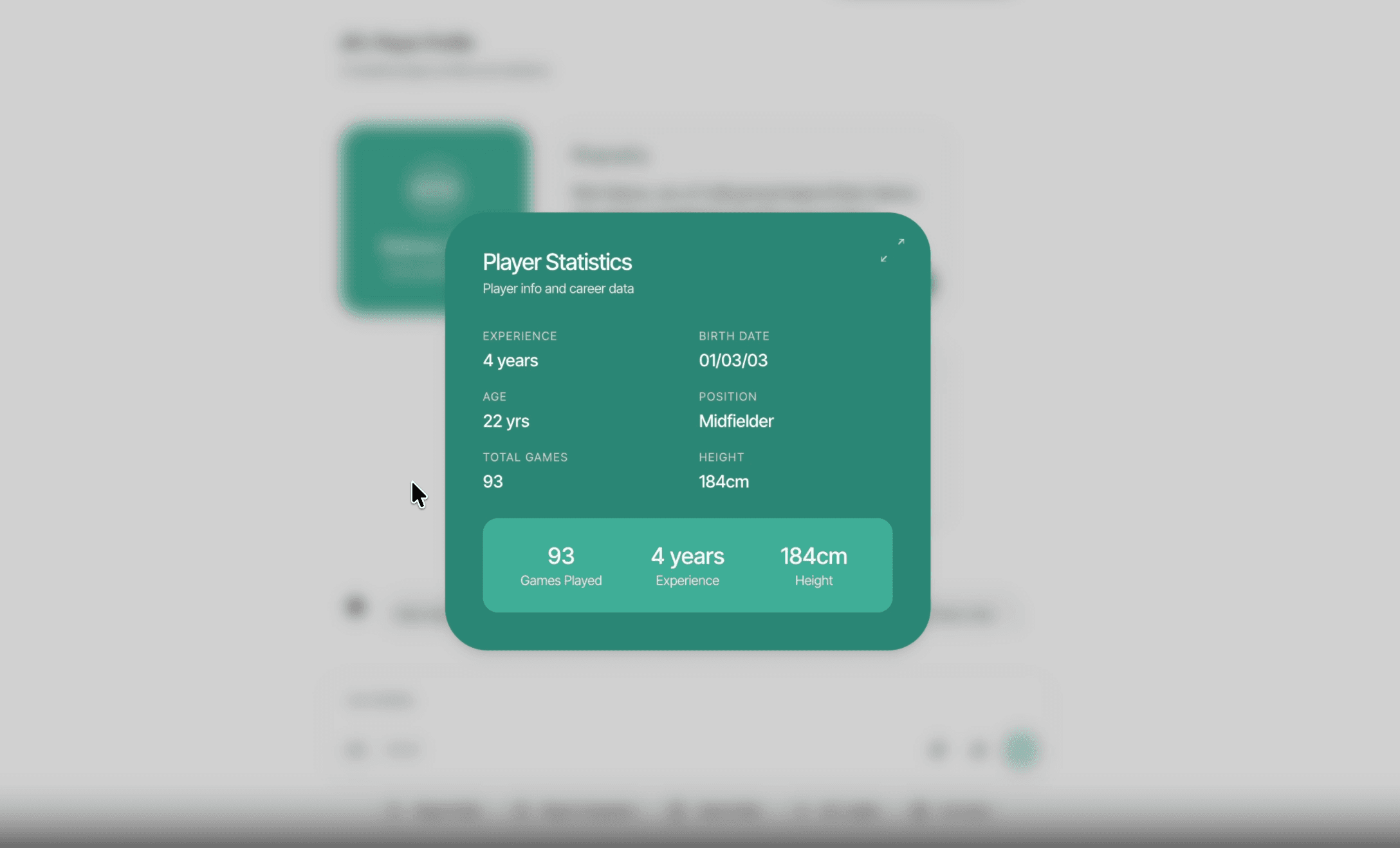
Player Stats Widget