Maincode Site
10.2025

The Rebranding Challenge
When I joined Maincode's design engineering team, the company was at an inflection point. They were preparing to announce Australia's first large language model, Matilda, and the Model Factory service for enterprise custom AI. However, their existing website communicated a scrappy startup aesthetic when they needed to project enterprise credibility. The visual identity felt engineering-first, which resonated with technical audiences but created barriers with the broader Australian audience we were trying to reach.
The brief was to redesign the website and evolve the brand identity to feel more mature and enterprise-ready while retaining the distinctly Australian character that differentiated Maincode in a market dominated by American AI companies. This wasn't about abandoning our roots but rather translating technical excellence into a visual language that enterprise clients would trust.
Defining the Visual Strategy
I began by analysing how existing AI companies establish visual credibility. Most follow a predictable formula: blues and greys, geometric sans-serif typography, abstract tech imagery. This creates trust through familiarity but offers no differentiation. Maincode needed to feel equally professional while being memorable.
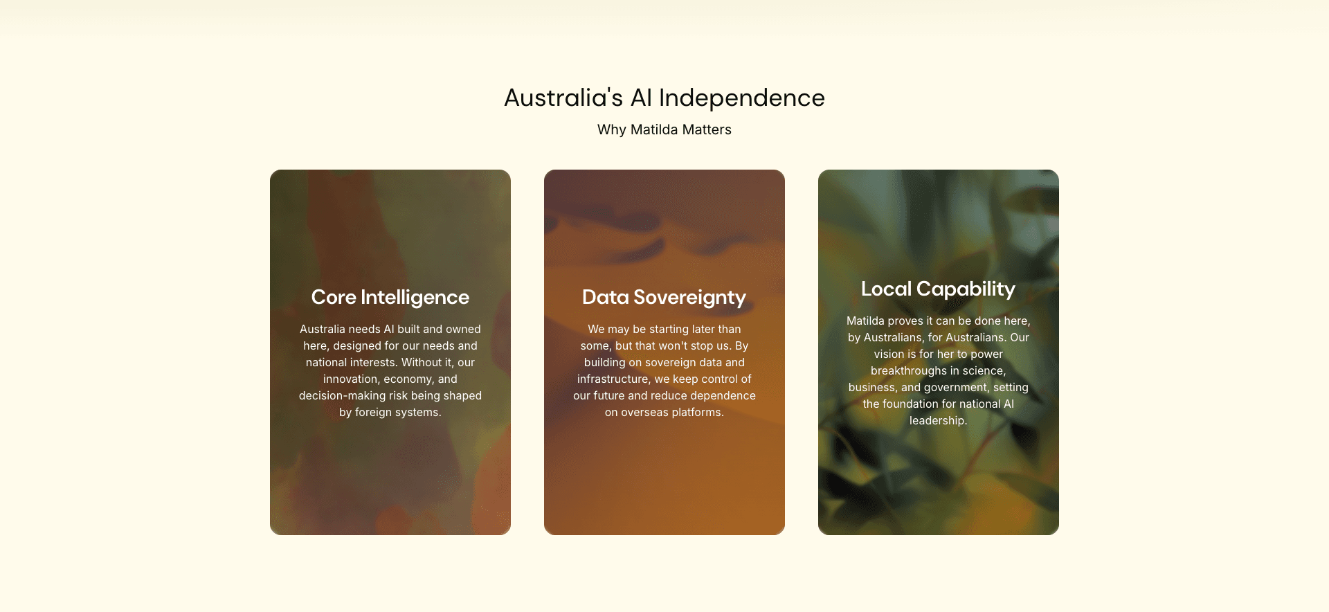
The Australian angle became our differentiator. Rather than generic tech aesthetics, we drew inspiration from the Australian landscape: ochre earth tones, the interplay of vast empty spaces and dense detail, the clarity of harsh sunlight. This created a palette and visual rhythm that felt both sophisticated and unmistakably Australian. I collaborated with the Design Engineering team lead to develop a gradient system using ochre, sky blues, and gum-tree greens.
Typography required careful consideration. The previous site used a tech-focused monospace font that signalled "code" but felt inaccessible. I selected a geometric sans-serif with slightly softened corners for headings, paired with a highly readable serif for body text. This combination projected professionalism while remaining approachable, and the serif choice subtly referenced academic credibility, important for a company built on research foundations.
Australian-style imagery in Maincode site
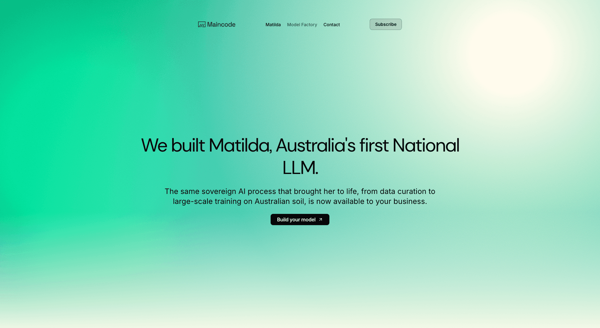
Designing the Matilda Identity
Matilda, as Australia's first LLM, needed a visual identity that could stand alongside international models like GPT or Claude while feeling distinctly local. The challenge was creating a logo that worked across contexts: in chat interfaces, on marketing materials, in technical documentation, and on the website hero section.
Myself and the lead design engineer collaborated on exploring numerous directions. Early concepts played with wattle flowers, native Australian symbols, and abstract interpretations of connection and intelligence. Through collaborative critique sessions, we refined toward increasing simplicity. The final Matilda mark uses clean geometric forms with a subtle nod to the form of a wattle flower.
The colour system for Matilda needed to complement the broader Maincode palette while establishing its own presence. I chose a rich, warm ochre as the primary colour, creating visual cohesion with the site's gradient system while giving Matilda a distinct identity.
Model Factory hero section
Website Structure and Content Strategy
The website needed to communicate two primary offerings clearly: Matilda itself and the Model Factory service. The site was structured to prioritise these equally, with myself and the design engineering lead creating dedicated sections that could each function as standalone landing pages while contributing to a cohesive narrative about Maincode's capabilities.
The Matilda section focused on establishing credibility and differentiation. Key messaging emphasised Australian data sovereignty, cultural relevance, and technical sophistication. This section with larger type, more white space, and prominent positioning to signal importance. The challenge was explaining what makes Matilda unique without getting lost in technical specifications that would bore non-technical visitors.
The Model Factory section targeted enterprise decision-makers considering custom AI solutions. This audience cares about process, security, and business outcomes more than technical architecture. I structured this content around the provided copy, which conveys the client benefits: domain-specific accuracy, data control, safety & security. Visual design here used more structured layouts, emphasising process diagrams and clear service descriptions.
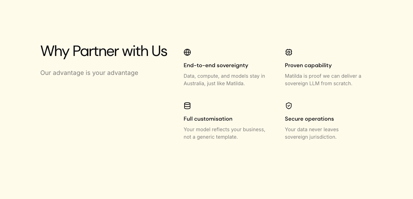
Benefits of the Model Factory service.
Technical Implementation Decisions
I built the site using modern web technologies, prioritising performance and maintainability. The tech stack included Next.js for server-side rendering and optimal loading performance, Tailwind CSS for a consistent design system, and Framer Motion for subtle animations that brought the interface to life without feeling gimmicky.
The Australian landscape-inspired gradients required technical finesse to implement efficiently. Rather than using image assets that would increase page load time, I created CSS gradient components that rendered and animated performantly.
The contact system integration was critical for capturing enterprise leads. I integrated the site with a mail service for effective lead generation.
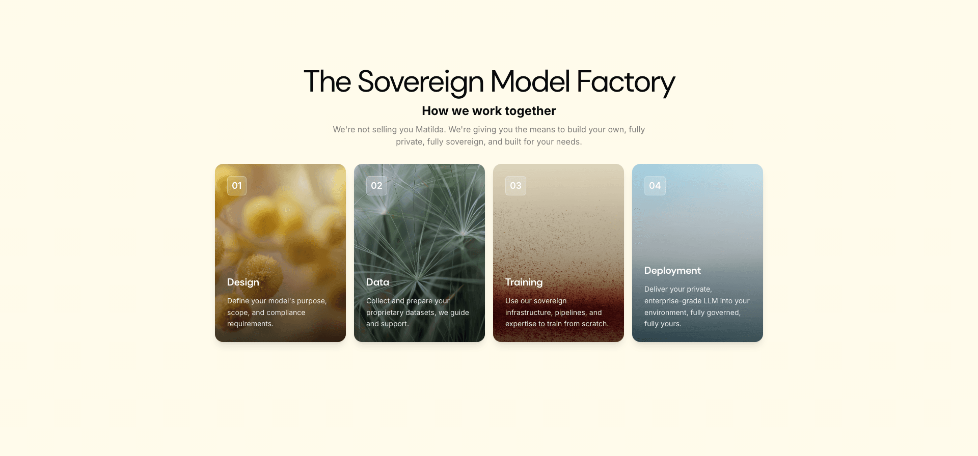
Model Factory stages
Outcomes and Reflection
From a learning perspective, this project reinforced that brand identity and web design are inseparable. Every design decision, from colour choices to typography to interaction patterns, communicates something about the company. The challenge is ensuring those communications align with business goals while remaining authentic to the company's actual culture and capabilities.
I gained deeper appreciation for the iterative nature of brand work. The Matilda logo went through more than twenty variations before we found the right balance of simplicity, memorability, and meaning. Early in my career, I might have settled on version five. Now I understand that great design often emerges only after exhausting obvious solutions.
The technical implementation taught me to think holistically about performance. Beautiful design means nothing if pages load slowly or interactions feel sluggish. Every gradient, animation, and image needed to justify its performance cost. This discipline produces better outcomes: sites that feel both polished and responsive.